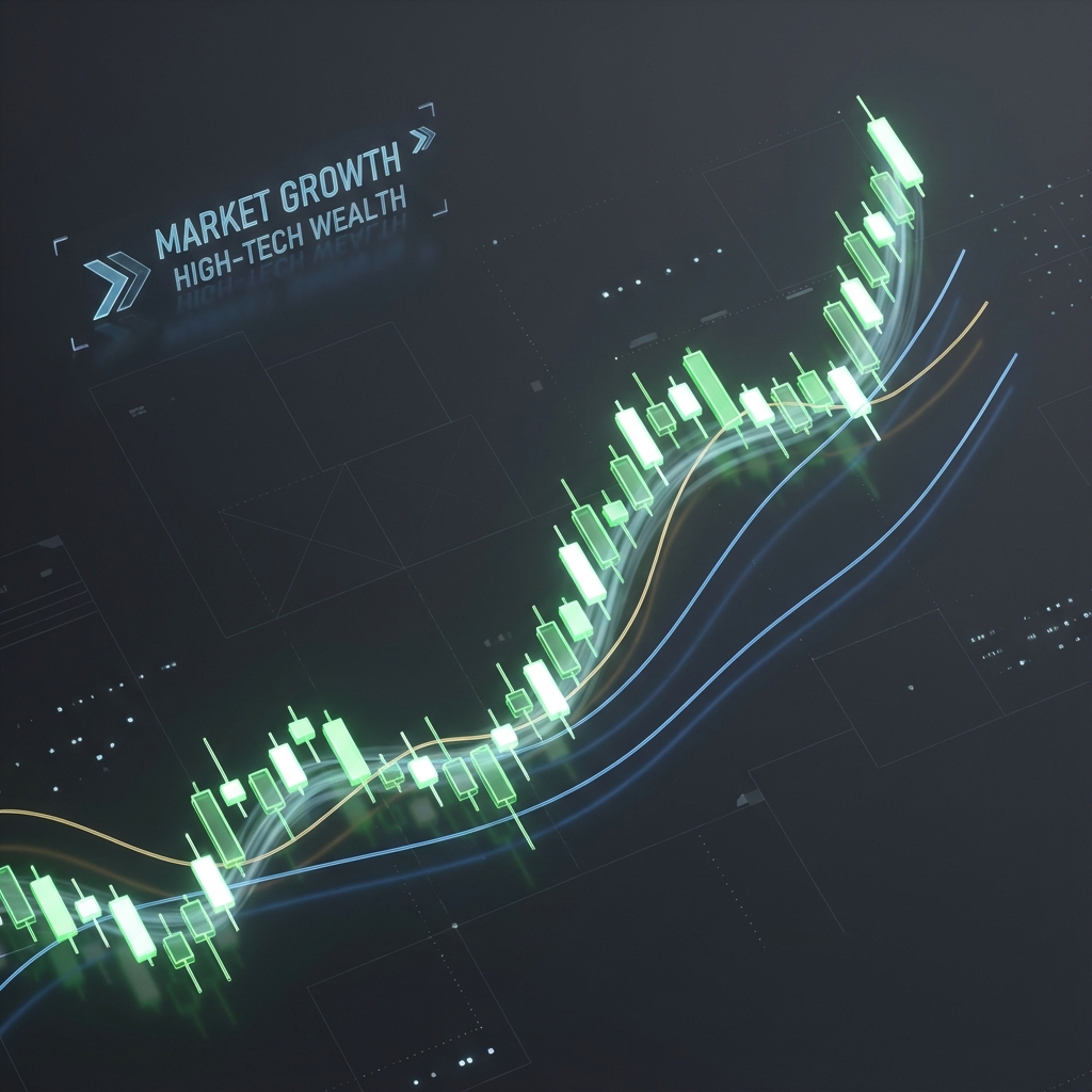
Technical Analysis for Long-Term Investors: Timing Your Entries for Maximum Wealth
The Map and the Compass: why Long-Term Investors Need Technical Analysis
If Fundamental Analysis (which we covered in Guide #1) is the map that tells you where to go, Technical Analysis is the compass that tells you when to start walking.
For decades, there has been a divide between "Fundamentalists" and "Technicians." Fundamentalists look at balance sheets; Technicians look at charts. However, the world’s most successful wealth builders realize that the two work best in harmony. A stock can be fundamentally undervalued (the "What"), but if it’s in a downward death spiral, you could lose money for years before it recovers.
Technical Analysis (TA) is the study of historical market data, primarily price and volume. It allows you to see the collective psychology of the market in real-time. By understanding these patterns, you can time your entries to buy at the "floor" and avoid buying at the "ceiling."
In this guide, we will strip away the "day trader" complexity and focus on the technical tools that every long-term investor needs to maximize their wealth and manage their risk.
Technical vs. Fundamental: The "What" vs. The "When"
- Fundamental Analysis: "This company is worth $150 per share, but it's trading at $100. I should buy it."
- Technical Analysis: "The stock is currently at $100, but it’s in a downtrend and just broke below its 200-day moving average. I’ll wait for it to stabilize at $85 before I buy."
By combining the two, you increase your Margin of Safety. You not only buy a good company, but you buy it at a moment when the probability of it going up is at its highest.
Core Concepts: The Pillars of Price Action
1. Trends: The Trend is Your Friend
The market moves in three directions: Up, Down, and Sideways.
- Uptrend: Characterized by "Higher Highs" and "Higher Lows." You want to buy the dips in an uptrend.
- Downtrend: Characterized by "Lower Highs" and "Lower Lows." You want to avoid these stocks until the trend reverses.
- Consolidation: The stock moves sideways in a range. This is often where a stock "builds a base" before a major move.
2. Support and Resistance: The "Floor" and the "Ceiling"
- Support: A price level where a downtrend tends to pause due to a concentration of demand (buying power). Think of it as a floor. If a stock hits $50 three times and bounces back up, $50 is a strong "Support."
- Resistance: A price level where an uptrend tends to pause because of a concentration of supply (selling power). It’s a ceiling.
Wealth Building Tip: Buy when a stock is near its support level, and be cautious when it's approaching a long-term resistance level.
The Investor’s Indicator Toolkit
You don't need 50 indicators. You only need three.
1. Simple Moving Averages (200-Day and 50-Day)
A Moving Average (MA) is the average price of a stock over a set period. It "smooths out" the daily noise.
- The 200-Day MA: This is the ultimate "Line in the Sand" for long-term investors. If a stock is above its 200-day MA, it is in a long-term bull market. If it's below, it is in a bear market.
- The Golden Cross: When the 50-day MA crosses above the 200-day MA. This is a massive "Buy" signal for long-term wealth.
2. Relative Strength Index (RSI)
RSI measures the speed and change of price movements on a scale of 0 to 100.
- Overbought (>70): The stock has gone up too fast and is due for a pullback. Avoid buying here.
- Oversold (<30): The stock has been beaten down emotionally and is often a bargain. This is where long-term investors look for "puke points" to buy.
3. Volume
Volume is the number of shares traded. It tells you if a move is "real."
- Confirmation: If a stock breaks above resistance on high volume, it means institutional investors (banks and hedge funds) are buying. This is a very strong signal.
Chart Patterns for Long-Term Entry
1. The "Base" (Consolidation)
Before a stock makes a massive run, it often spends months moving sideways. This is called "Basing." Institutional investors are quietly building their positions. When the stock finally breaks out of the base, it often begins a multi-year growth phase.
2. The "Cup and Handle"
This is a classic growth-stock pattern. It looks like a tea cup. The "Cup" shows a gradual recovery from a correction, and the "Handle" is a small final dip before the stock rockets to all-time highs. This is the pattern legendary investor William O'Neil used to find his biggest winners.
Risk Management: Using TA to Protect Your Profits
1. Stop Losses (The "Emergency Brake")
A stop loss is an order to sell your stock if it drops below a certain price.
- Investor Strategy: If you buy at $100 because of strong support at $95, you might place a stop loss at $92. If the support breaks, your thesis is wrong, and you sell to prevent a 10% loss from becoming a 50% loss.
2. Trailing Stops
As your stock goes up, you move your stop loss up with it. This allows you to "let your winners run" while ensuring that you lock in your profits if the trend eventually reverses.
The Danger of "Analysis Paralysis"
It’s easy to get lost in "Indicators." If you add too many, you will always find one that says "Buy" and one that says "Sell."
The Golden Rule of TA: Price is the only thing that matters. Indicators are just secondary hints. If the stock price is going up, the chart is good. Don't overcomplicate it.
Conclusion: Trading with Your Eyes Open
Technical Analysis gives you an objective way to view the market. It removes the need for "guilt" when a stock drops and the need for "greed" when it's at all-time highs. Use it to find the best entry points, set your risk levels, and stay on the right side of the long-term trend.
By combining the "What" of Fundamental Analysis with the "When" of Technical Analysis, you become a complete investor—one who can navigate the storms and capture the sunshine of the stock market.
Deep Dive: The Death Cross and the Warning Signs
Just as the Golden Cross is a signal of a new bull market, the Death Cross is the signal to head for the exits (or at least raise cash).
- The Death Cross: Occurs when the 50-day moving average crosses below the 200-day moving average.
- Why it matters: Historically, almost every major market crash (1929, 2000, 2008) was preceded by a Death Cross. While it can produce "false signals," for a long-term wealth builder, it’s a signal to stop buying and re-evaluate your risk exposure.
Fibonacci Retracements: The Golden Ratio of the Market
The universe follows mathematical patterns, and strangely, the stock market does too. Fibonacci Retracements are used to predict where a stock will stop dropping after a big run.
- The Theory: After a stock goes up, it almost always "retraces" a portion of its gains.
- The Key Levels: 38.2%, 50%, and 61.8%.
- Investor Strategy: If a great company like Microsoft runs from $300 to $400, a Fibonacci tool will tell you that it’s likely to find "Support" at $362 (38.2%) or $350 (50%). These are your Buy Zones. Instead of chasing the stock at $400, you wait for the "Fib level" pull-back.
Reading the "Story" of the Candlesticks
Japanese Candlestick charts provide more information than simple line charts. They show the battle between buyers (Bulls) and sellers (Bears).
1. The Doji (Indecision)
A Doji has a very small body (opens and closes at the same price). It means neither the bulls nor the bears won. If you see a Doji after a long downtrend, it often signals a reversal is coming.
2. Bullish Engulfing (Strength)
This occurs when a large green candle completely "swallows" the previous small red candle. It signals that buyers have aggressively taken control of the stock.
3. Hanging Man (Warning)
A small body with a long lower "wick" at the top of an uptrend. It looks like a man hanging. It signals that buyers are losing steam and the trend may be about to break.
How to Avoid the "False Breakout"
One of the most frustrating things in TA is when a stock breaks above resistance, you buy, and it immediately crashes back down. This is a "Bull Trap."
Three Ways to Verify a Breakout:
- The 3% Rule: Only buy if the stock closes at least 3% above the resistance line.
- The Test and Rethink: Often, a stock will break out, then drop back down to "test" the old resistance line (which should now act as support). Buying on the retest is much safer than buying the initial breakout.
- Relative Strength (RS) Line: Compare the stock to the S&P 500. If the stock is breaking out but its RS line is flat or dropping, it means the stock is actually weaker than the market. Don't buy it.
Using TA for Dividend and ETF Investors
You might think: "I'm an index investor, why do I care about charts?"
The Answer: Because markets move in cycles of Exuberance and Despair. Even if you are buying an ETF like VTI, you can use the 200-day Moving Average to time your "extra" contributions.
- When VTI is 10-15% above its 200-day MA, it’s "extended." Keep your standard contribution.
- When VTI is below its 200-day MA and the RSI is approaching 30, it is "on sale." This is the moment to deploy that extra cash you've been saving. This simple chart-based tactic can add an extra 1-2% to your annual returns over a lifetime.
Conclusion: The Objective Investor
Technical Analysis is not a crystal ball. It is a filter. It helps you remove the "story" and the "hype" and see exactly what people are doing with their money.
By mastering these technical tools, you gain the confidence to buy when everyone else is panicking and the wisdom to take profits when everyone else is celebrate. You become an objective observer of the greatest game on earth.
Disclaimer: Past technical performance does not guarantee future price action. Use technical analysis as one part of a diversified decision-making process.